Contents of the docs
ai-instructions · Docs
Styleguides
Twenty design styleguides for websites, from calm to playful, and how to hand them to an agent.
On this page
The folder styleguides/ holds one file per design
style. A styleguide describes colours and their roles, typography, layout, components, motion and a checklist – precise
enough for an agent to build a page from it without seeing a reference. The styleguides are written in German.
Overview
The previews are sample pages built from the colours, fonts and components of each styleguide. Names and contents in them are made up. Exception: Contour, Graphite, Noir, Plum and Sunset grew out of the design drafts for aspect42; their previews show those drafts in the aspect42 colours.
Civic
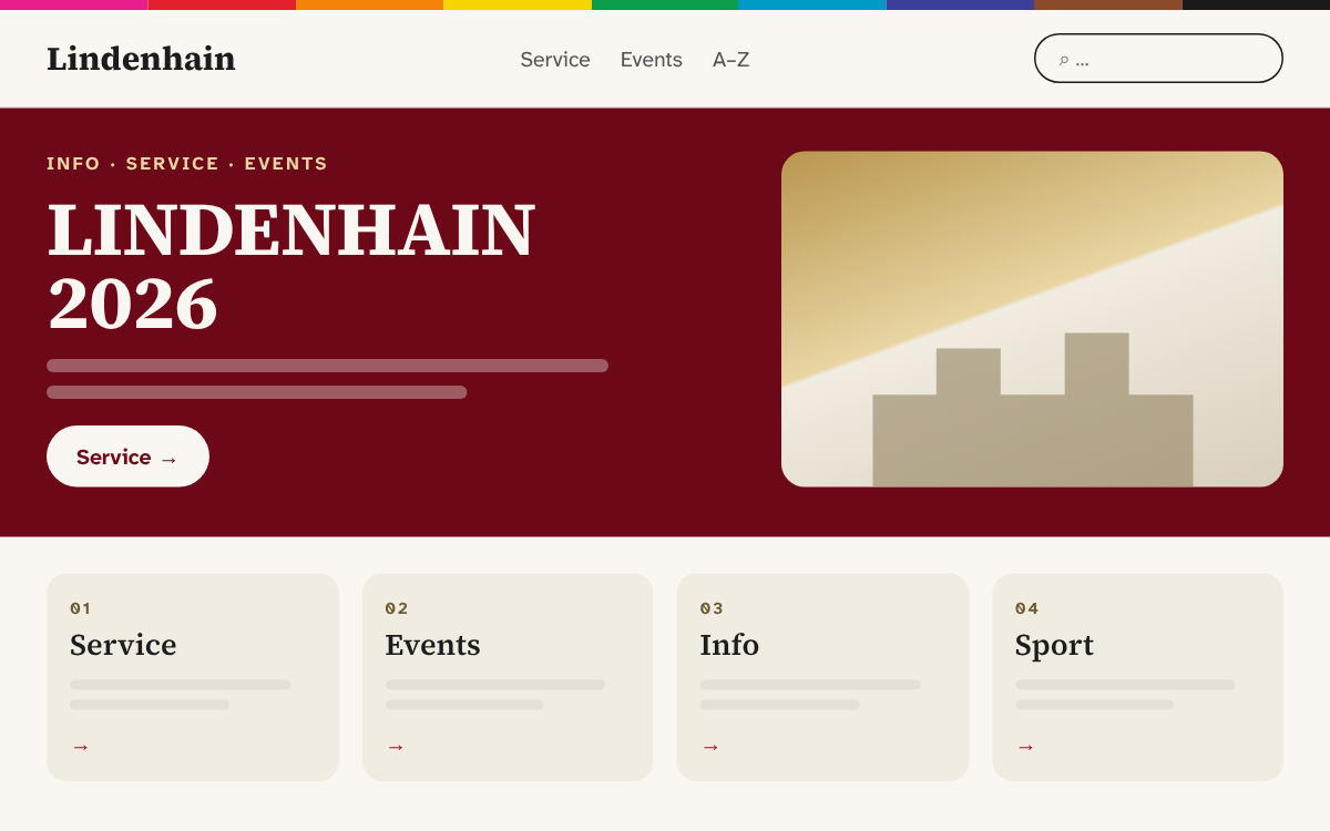
Warm cream surfaces, serif headlines and one strong accent, calm service cards. Suits: service-oriented sites; default for new sites. File: civic.md
Bento
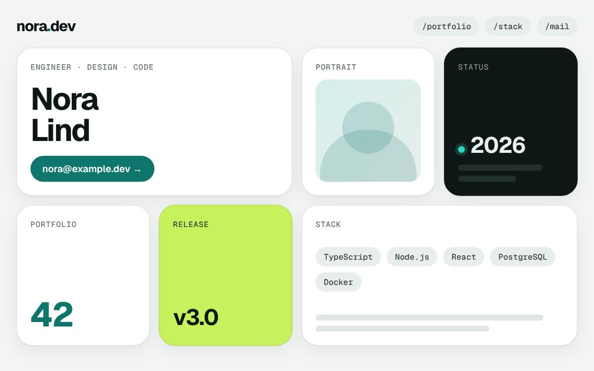
Tile grid in petrol with one dark contrast tile and one lime tile, light and dark. Suits: portfolios, product pages, dashboards. File: bento.md
Blockcraft
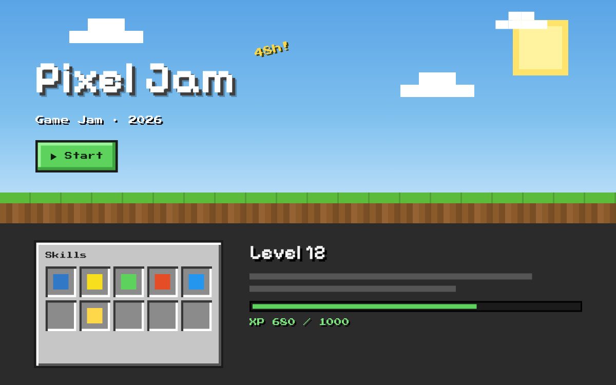
Voxel world of sky, grass and stone blocks, pixel font, inventory and XP bar. Suits: game jams, coding courses, gaming communities. File: blockcraft.md
Blueprint
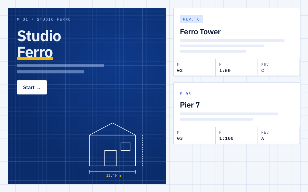
Grid paper, deep blue blueprints with dimension lines, drawing sheets with title blocks, pencil yellow. Suits: engineering offices, architecture, technical consulting. File: blueprint.md
Comic
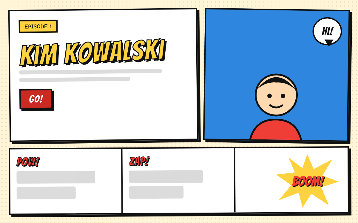
Newsprint with halftone dots, panels in thick ink, speech bubbles and sound effects. Suits: events, offers for kids and teens, product launches. File: comic.md
Contour
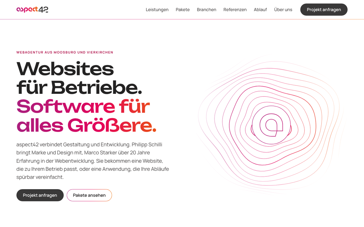
Everything in lines on white: topographic contour lines, 1 px gradient borders, outlined numerals, colour never as a surface. Suits: agencies, design studios, brands with an outline logo or a gradient. File: contour.md
Cosmos
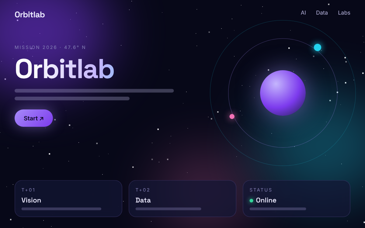
Deep space with stars and nebulae, gradient headline, glass cards and orbits. Suits: tech start-ups, AI and data products, astronomy. File: cosmos.md
DasRed
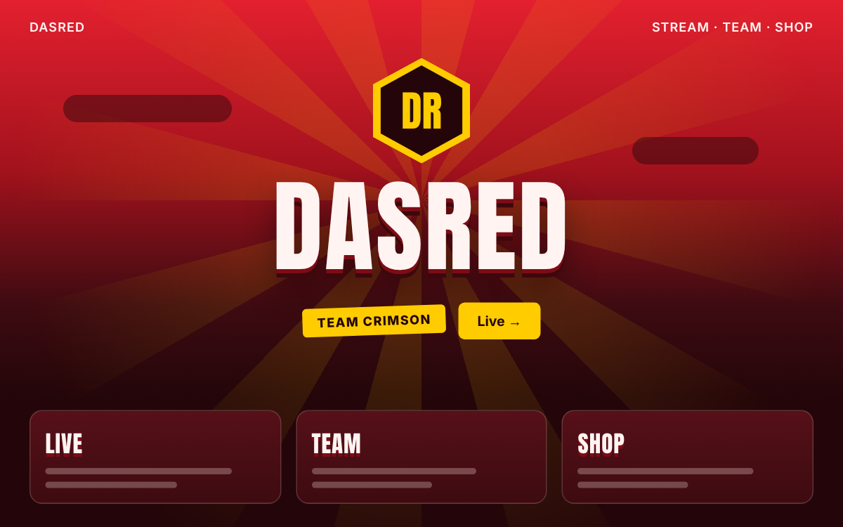
Red sky over purple night, golden rays, golden emblem and a name with stacked shadow. Suits: brands, teams, streamers with a red identity. File: dasred.md
Editorial
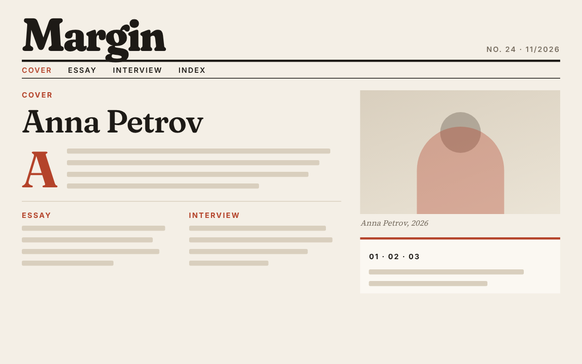
Magazine on warm paper: masthead, cover story with drop cap, fact box, rust red. Suits: authors, consultancies, culture, long reads. File: editorial.md
Graphite
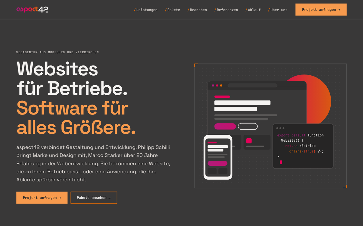
Logo anthracite as the page colour, outline wordmark as key visual, frames with orange corner marks, mono labels in brackets. Suits: development agencies, IT services, technical products. File: graphite.md
Hello World
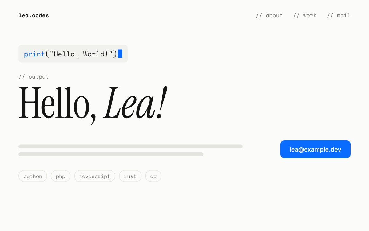
White paper, a line of code with a blinking cursor and its output below in a large serif. Suits: developer portfolios, dev tools, tech blogs. File: hello-world.md
Narf
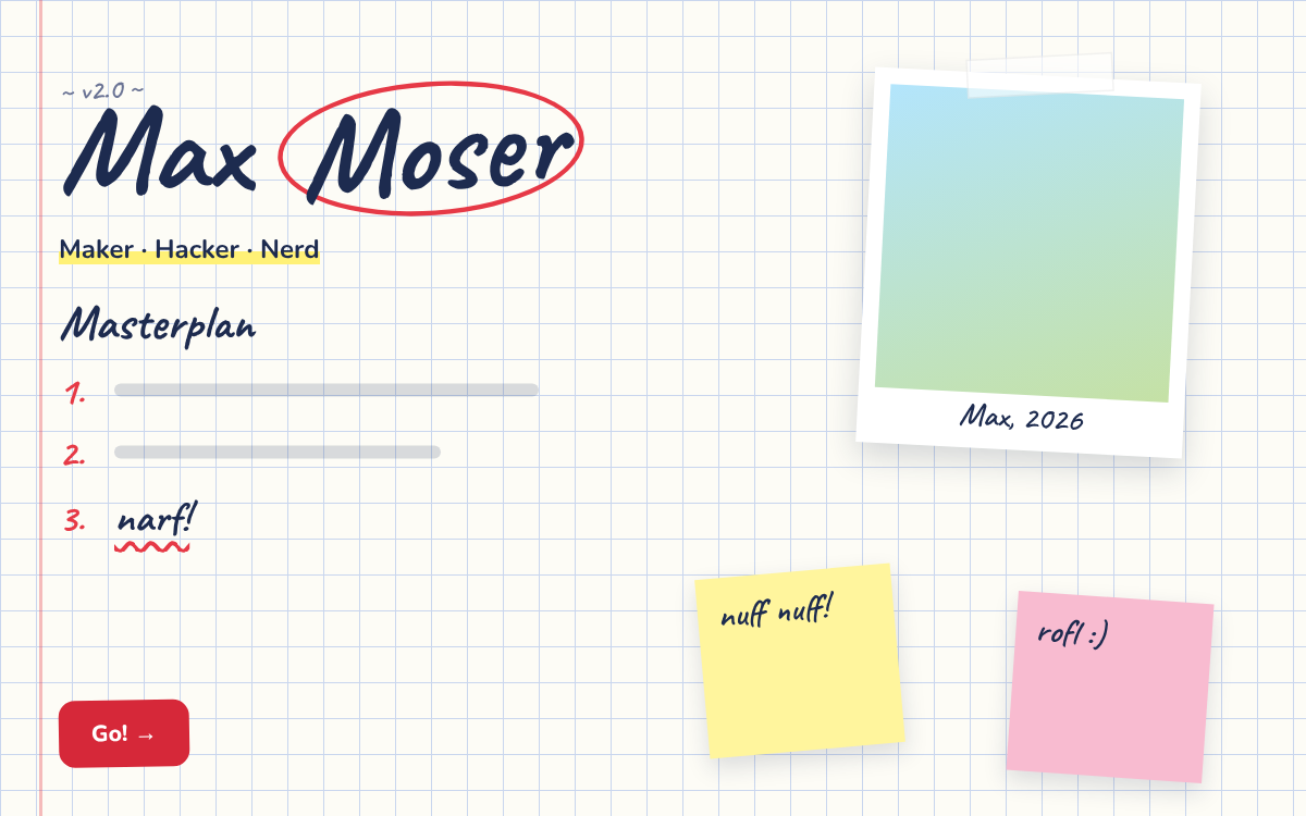
Lab notebook on grid paper, handwriting, highlighter, red circles, taped photo and sticky notes. Suits: maker portfolios, hackspaces, side projects. File: narf.md
Noir
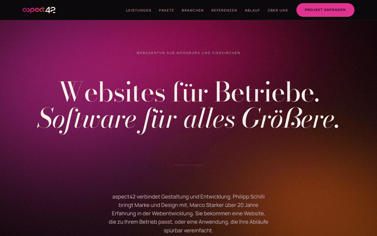
Deep black, large Bodoni with an italic counter-voice, hairlines, generated fields of light in the brand colours. Suits: ambitious agencies and studios, architecture, culture. File: noir.md
Philipp
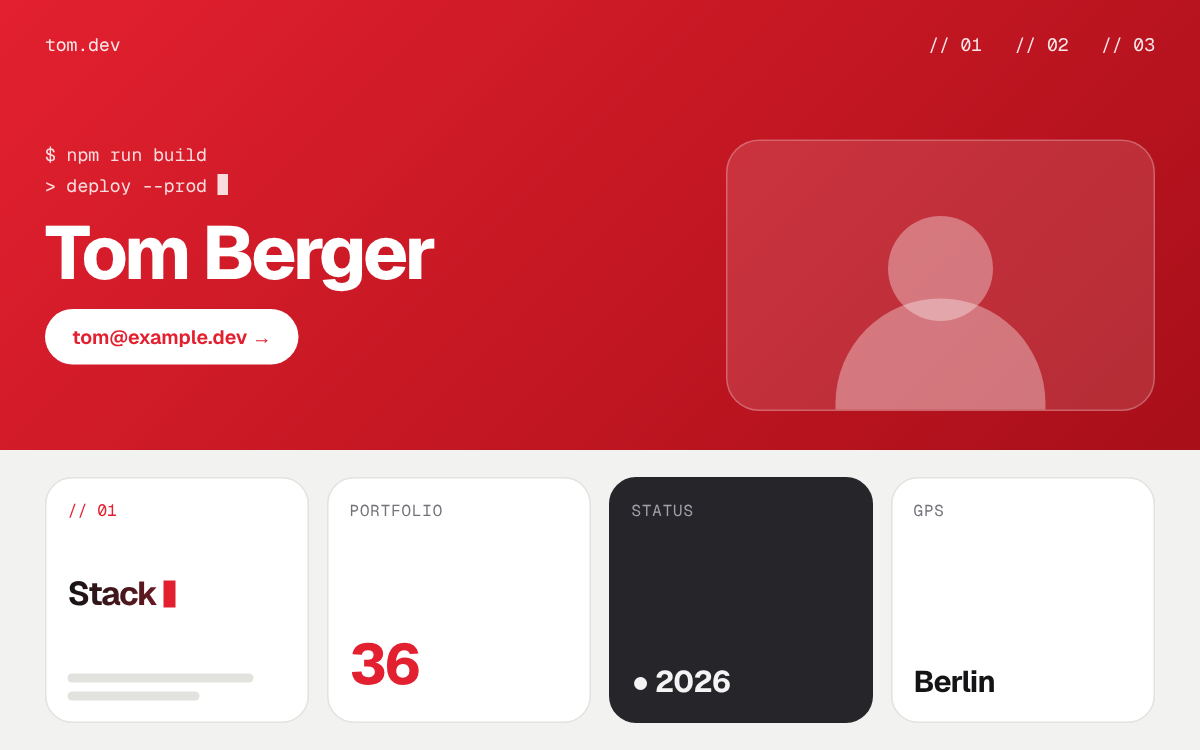
Red hero with lines of code, bold sans headline, portrait tile and a bento row below. Suits: freelancers, agencies, dev tools with a strong brand colour. File: philipp.md
Plum
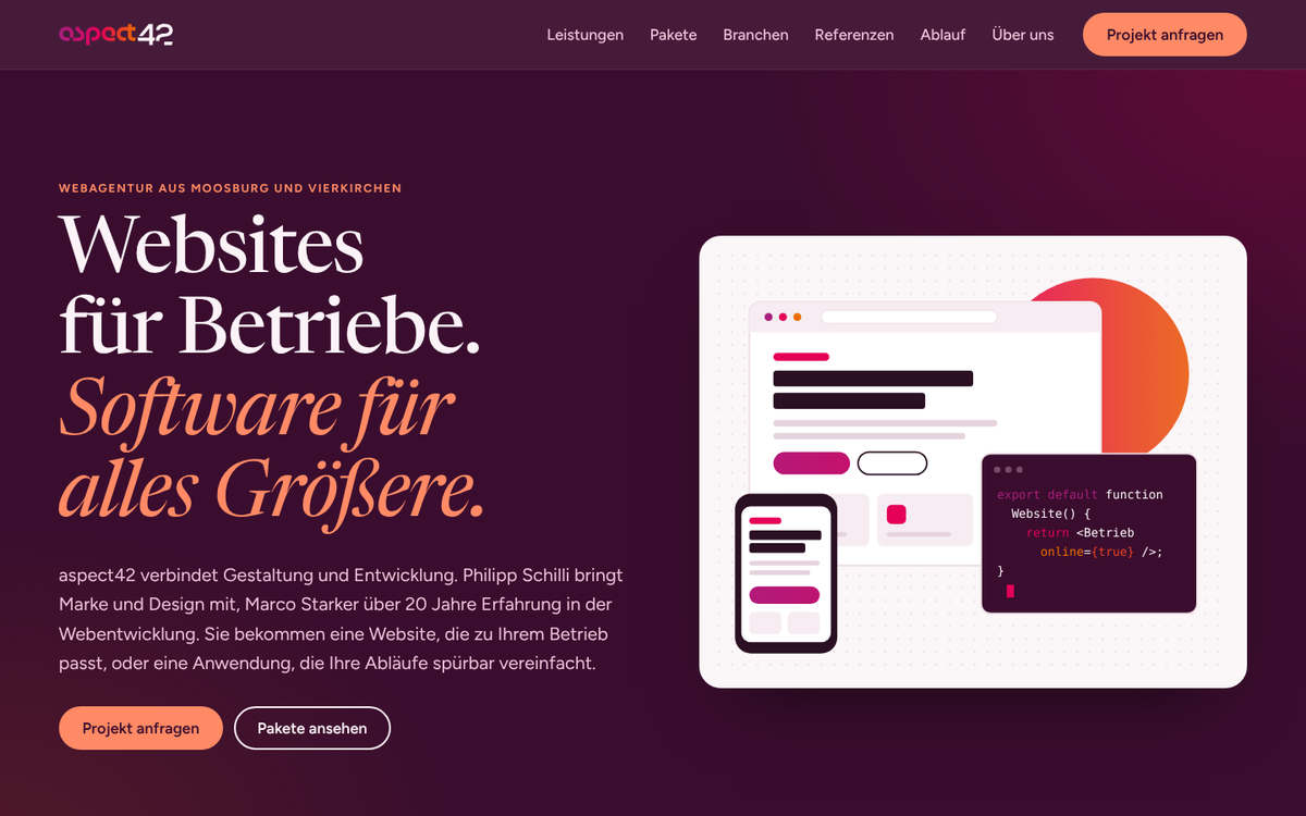
Plum and blush alternating, coral as the action colour on dark, Newsreader with italic accents, arched portraits. Suits: coaching, consulting, agencies, culture. File: plum.md
Retro 90s
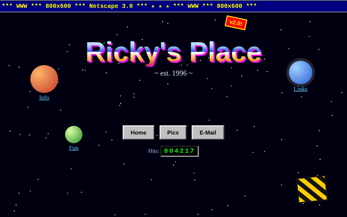
Homepage from 1996: starfield, chrome lettering, planets as navigation, grey 3D buttons, hit counter. Suits: anniversaries, retro events, fun pages. File: retro90s.md
Studio
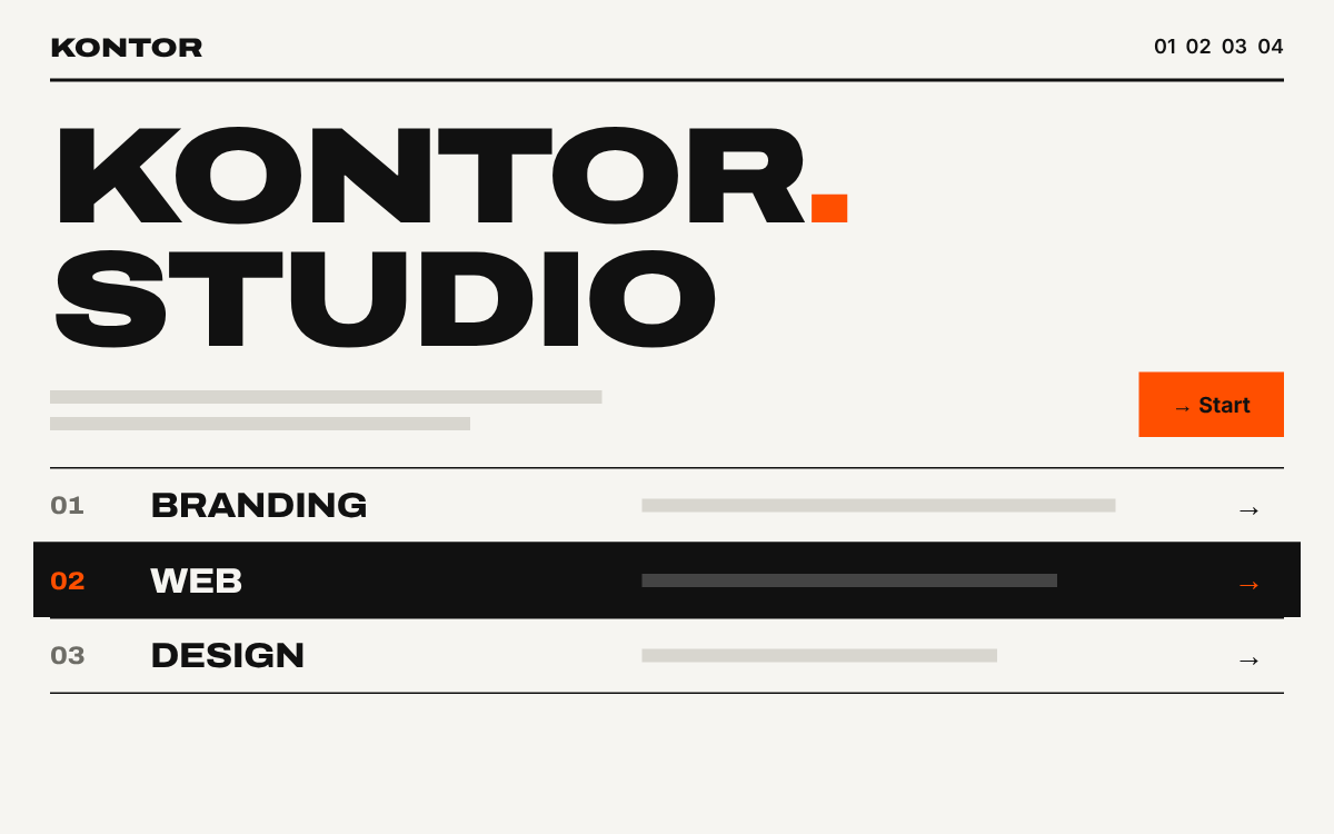
Swiss grid: huge wide capitals, black rules, numbered rows, signal orange. Suits: agencies, studios, consultancies. File: studio.md
Sunset
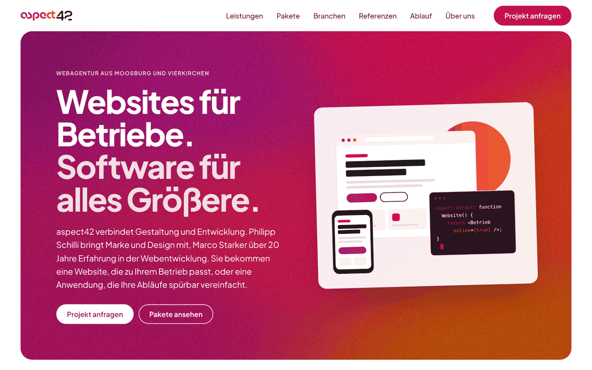
Large grainy gradient panels at the start and end of every page, soft white cards in between. Suits: agencies, start-ups, apps, brands with a gradient. File: sunset.md
Superhero
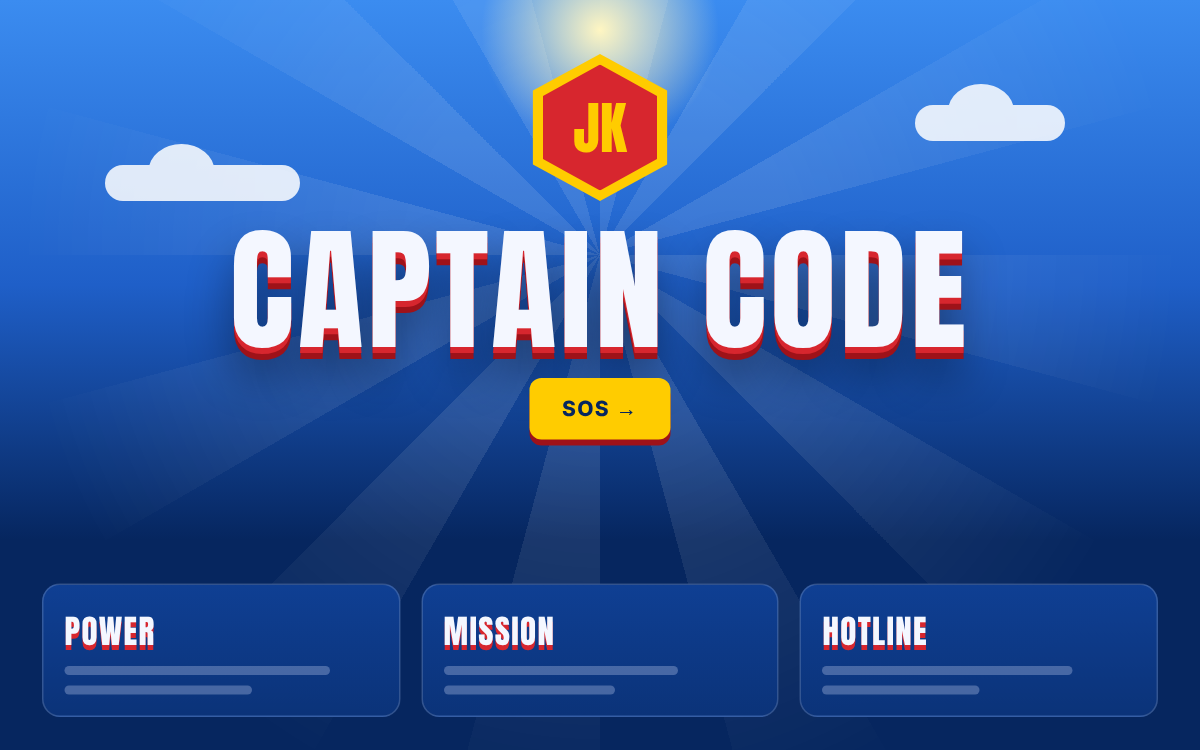
Blue sky with sun rays and clouds, own emblem, name with red shadow, sun yellow. Suits: freelancers, emergency services, campaigns. File: superhero.md
Terminal
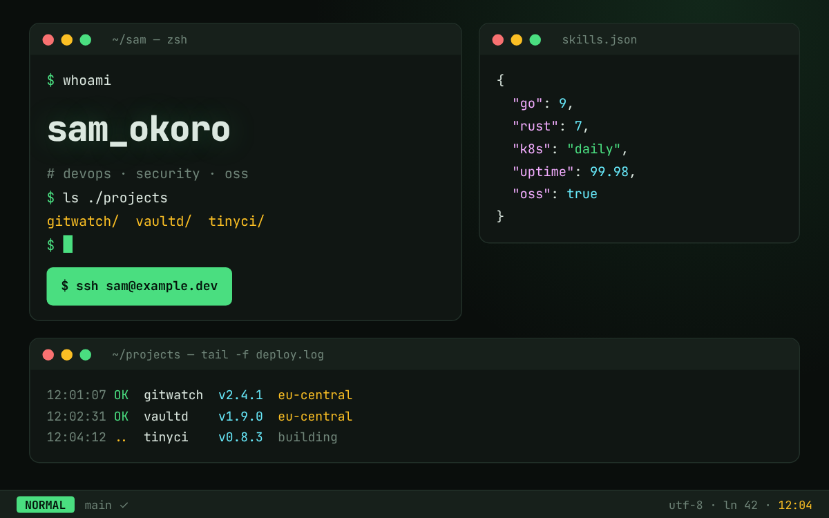
Dark shell with windows, prompt, typed commands, syntax highlighting and a status bar. Suits: dev tools, CLIs, open source, DevOps. File: terminal.md
Structure of a styleguide
Most styleguides follow the same outline:
| Section | Contents |
|---|---|
| Purpose, summary | what the style is for and what it looks like in one paragraph |
| Guiding idea | the principles every decision follows |
| Colours and roles | every colour with value and job (surface, text, action, state …) |
| Typography | fonts, sizes, weights |
| Layout, components, motion | grid, surfaces, typical building blocks, animations |
| Dos and don'ts | checklist for the finished result |
| Tokens as CSS | colour roles as CSS variables to copy |
| Compact prompt | the style in a few sentences, ready for an agent |
Civic differs: instead of tokens and a compact prompt it has a section on applying it to another project, with its own checklist.
Usage
Give the agent the whole styleguide and say what comes from the project:
Design the landing page following ~/Web/ai/styleguides/bento.md.
Keep layout, typography and components, but replace the petrol accent with our brand colour #1F6FEB.
Check the result against section "Dos und Don'ts" before you finish.
For a quick draft the "Kompakter Prompt" (compact prompt) section at the end of the file is often enough.
Important
Some styleguides draw on well-known motifs (comics, block games, superheroes). Only principles and mood are taken over, never characters, logos, crests or other protected motifs.